Official Recruitment Website Redesign Project @ E.SUN BANK

Overview
The purpose of the Official Recruitment Website Redesign Project is to create a visually appealing and user-friendly website that effectively communicate the company's brand and culture, and attract top talent to apply for job opportunities. The project focused on enhancing the user experience and streamlining the application process, making it easy for candidates to learn about the company, search for job openings, and submit their applications. The goal is to increase the volume and quality of job applications, and ultimately, to find the best fit for the company and its employees.
My Role
This project was designed and developed from Dec 2020 to Jan 2021. I worked on this project as a UX/UI Designer and Front-End Developor.
Platforms & Screen Sizes
Web
The Problem
The HR team reported high bounce rates and low job application rates on the company's old recruitment website. Upon analyzing the report, I identified three key areas for improvement:
- The action buttons were not prominently displayed and the page contained an overwhelming amount of information, making it difficult for users to navigate and proceed with the application process.
- The website's structure was confusing and the user flow was unclear, adding to the frustration of potential job applicants.
- The outdated design of the website did not align with the company's core value of embracing digital transformation.

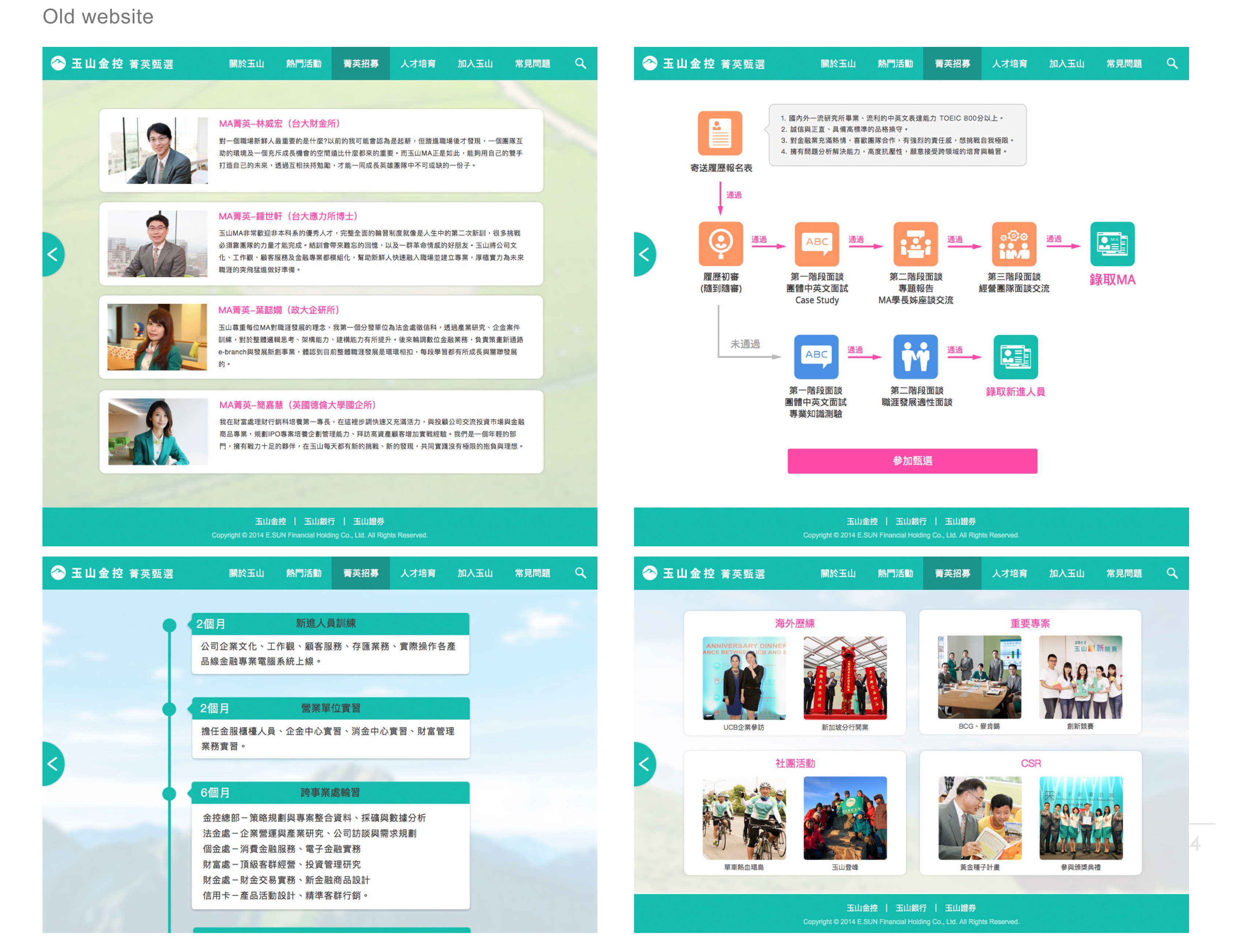
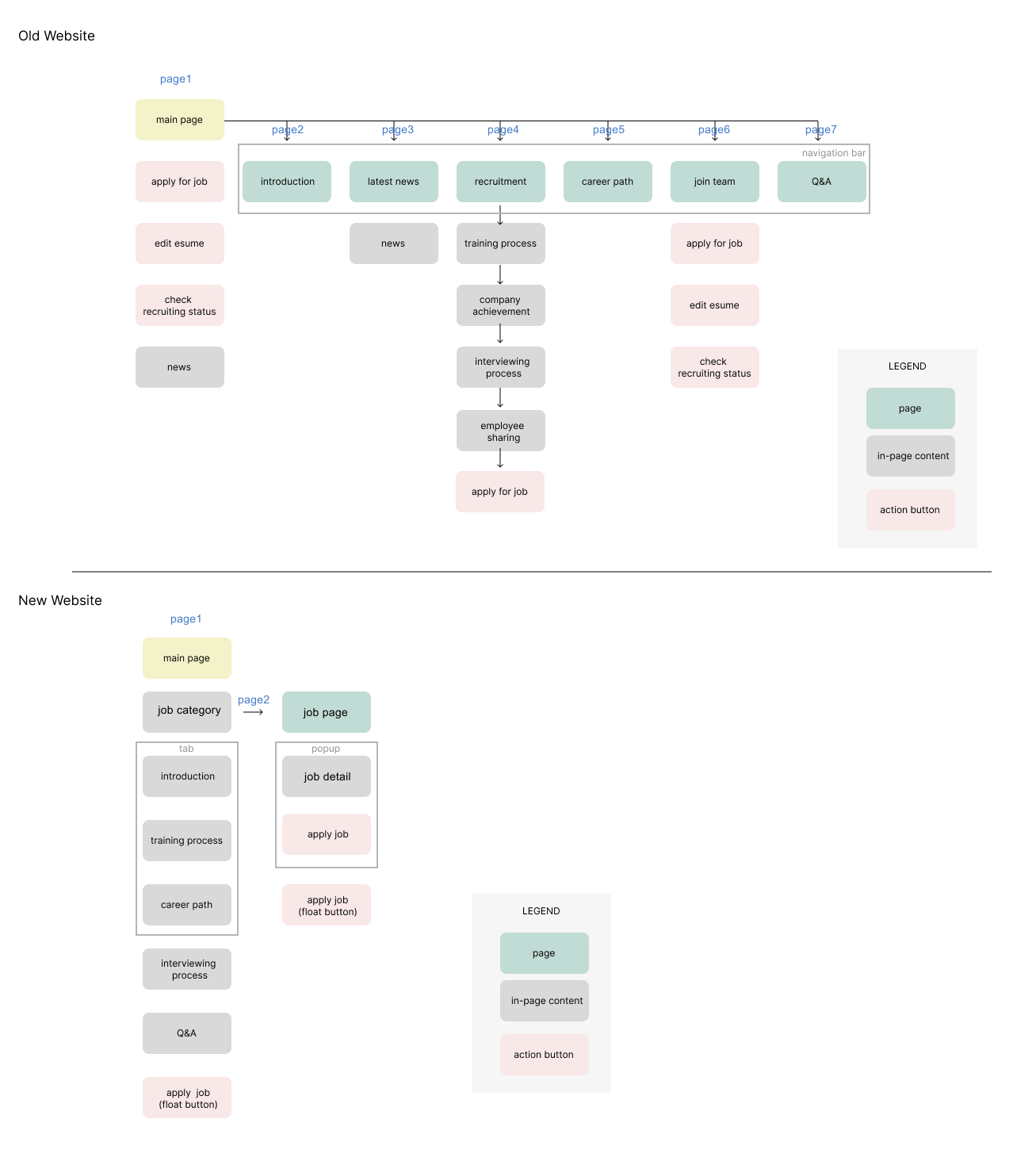
The old website had a complex hierarchy. For example, there was an overwhelming amount of information in recruitment page, which made users feel lost and unsure of where to begin.
Competitor Analysis
I conducted competitive analysis to understand the best practices in candidate onboarding processes. Through research of other job sites and recruitment websites of competing banks in Taiwan, I discovered several key insights:
- It's essential for candidates to have a clear understanding of a company's core values and hiring process.
- The onboarding process should be quick and straightforward.
Design solutions
- UX Design
- UI Design
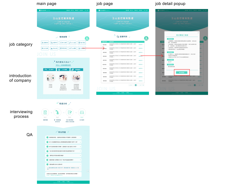
I collaborated closely with the HR team to thoroughly analyze the existing job application process and identify pain points for users. Through this analysis, I recommended simplifying the hierarchy to only two levels and suggested that HR reserve important pieces of information for job applicants. We then consolidated job category information, company introduction, interview process, and Q&A into a unified, single page, which was designed to be intuitive and streamlined. By redesigning the user flow and making it more straightforward, we were able to reduce the number of steps required to apply for a job from several steps to just three, which has resulted in a faster and more convenient process for users.

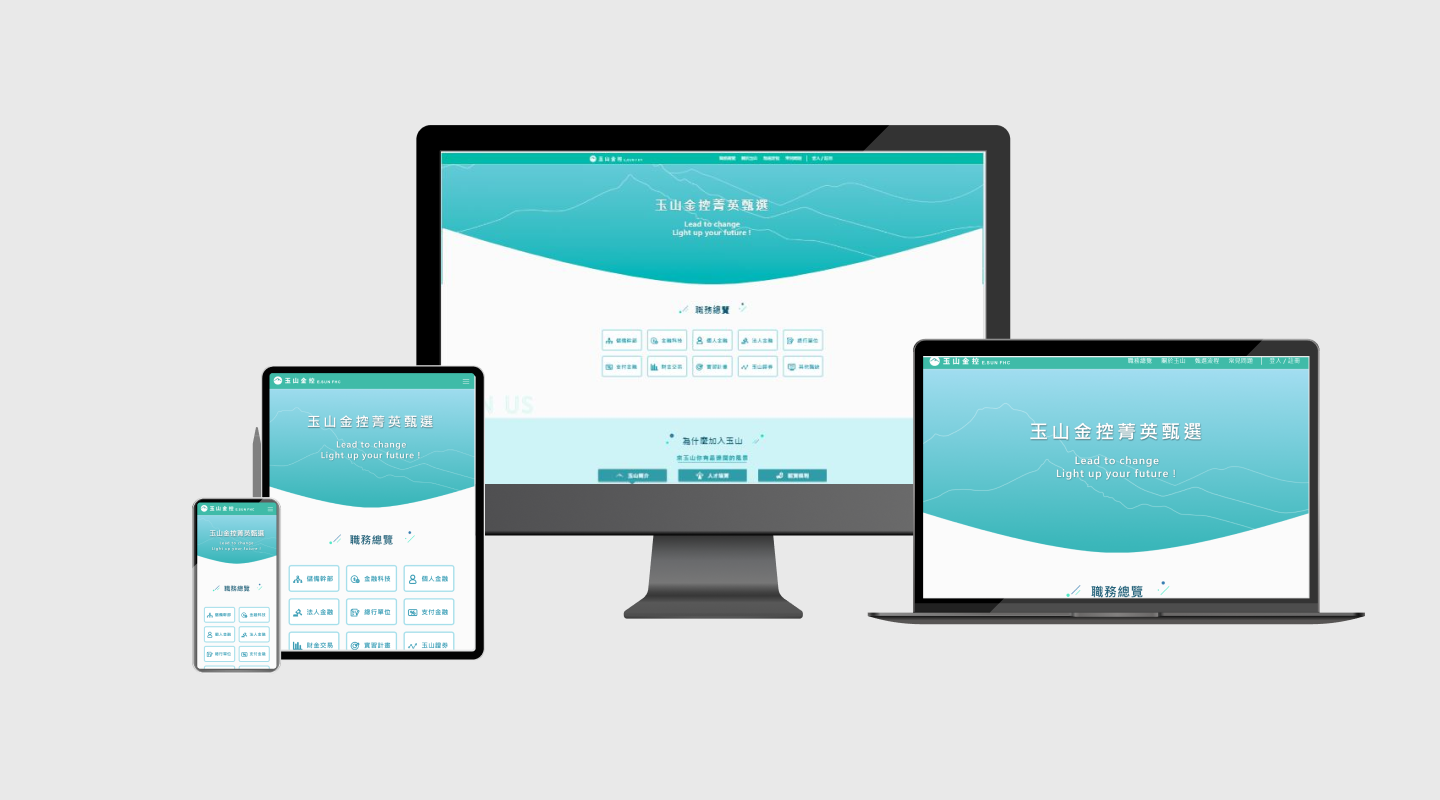
The updated website will feature a modern and innovative UI design that incorporates illustrations and motion to create a friendly, youthful, and vibrant atmosphere. The use of illustrations and motion will enhance the user experience and make the website feel engaging and interactive, encouraging users to explore the site and learn more about the company and its job opportunities. To ensure ease of use, clear and prominent action buttons have been added throughout the site, guiding users towards their desired action.

In the new website, we incorporated a scrolling feature in the navigation bar that allowed users to quickly move to specific sections on a single page, resulting in a more streamlined and user-friendly experience.
Outcome
The Redesign Official Recruitment Website was lunched on Feb 2021. The project resulted in a 40% increase in the number of candidates applying for job openings, as the new website design made it easier for potential candidates to find job opportunities and apply for them. The outcome of it is a high-performing, visually appealing, and user-friendly recruitment website that meets the needs of both the company and its potential candidates.